WRITINGS
EXPLAINING
◊
My Central Design Philosophy
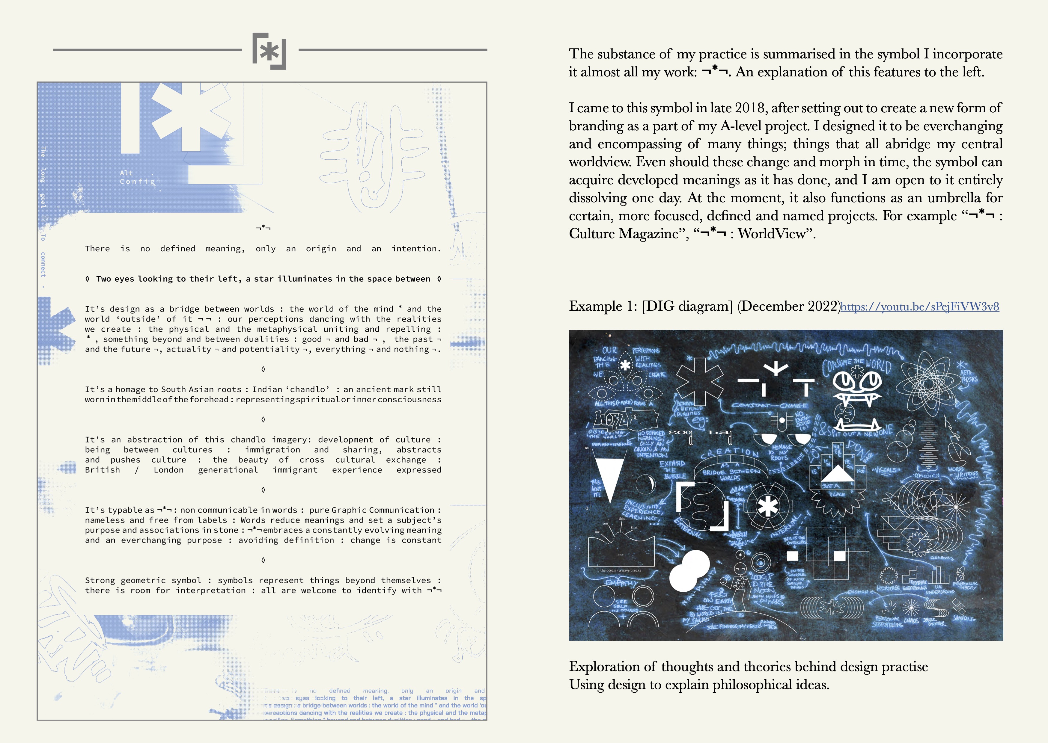
No defined meaning, only an origin and intention
The long goal : to connect
Two eyes looking to their left, a star illuminates in the space between
◊
It’s design : a bridge between worlds : the world of the mind * and the world ‘outside’ of it ¬*¬ : our perceptions dancing with the realities we create : the physical and the metaphysical uniting and repelling :
(non-dualism) : * = something beyond and between dualities : ¬ = dualities, eg. good ¬ and bad ¬ , the past ¬ and the future ¬, actuality ¬ and potentiality ¬, everything ¬ and nothing ¬
◊
Design for practical philosophy : Applying non dual principles to design : unity amid diversity as a ground for creating : London’s philosophy : locality as intersection : Designing for a multi-culture
◊
It’s a homage to my South Asian roots : Indian ‘Chandlo’ : an ancient mark still worn in the middle of the forehead : respresenting spiritual or inner consciousness : where ¬ are eyes of observation, * is a star of insight
◊
It’s an abstraction of the Chandlo imagery : development of culture : being between two or more cultures : immigration and sharing, both abstract and push culture : the beauty of cross cultural exchange : British/London generational immigrant experience expressed : re-working a nuanced cultural experience into something recieved at a more objective and diverse level : framing interpretations of ‘Brown Art’
◊
It’s typable as ¬*¬ : Non communicable in words : pure graphic communication : nameless and free from labels : words can reduce meanings and set a subject’s purpose and assosiations in stone : ¬*¬ embraces a constantly evolving meaning and an everchanging purpose : avoiding definition : change is constant
◊
It’s a strong geometric symbol : studying semiotics : symbols represent things beyond themselves : perception :
all are welcome to identify with ¬*¬, and give it their own meaning
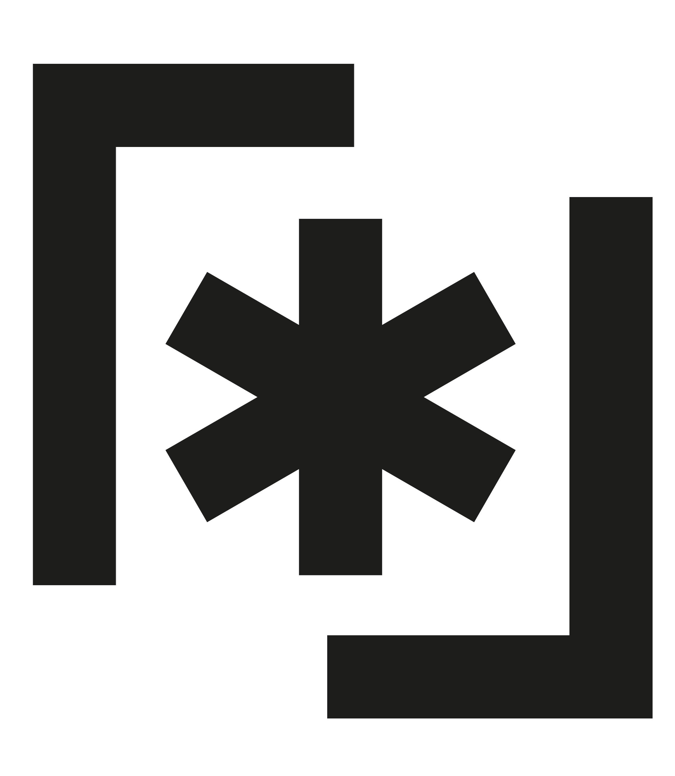 Above : an alternative form designed for large scale : merging and scrambling the 3 symbols, reducing their separateness : in this form, the * (star) is ‘boxed in’ by the two ¬ (eyes), rather than the original form being above and inbetween : meaning
◊
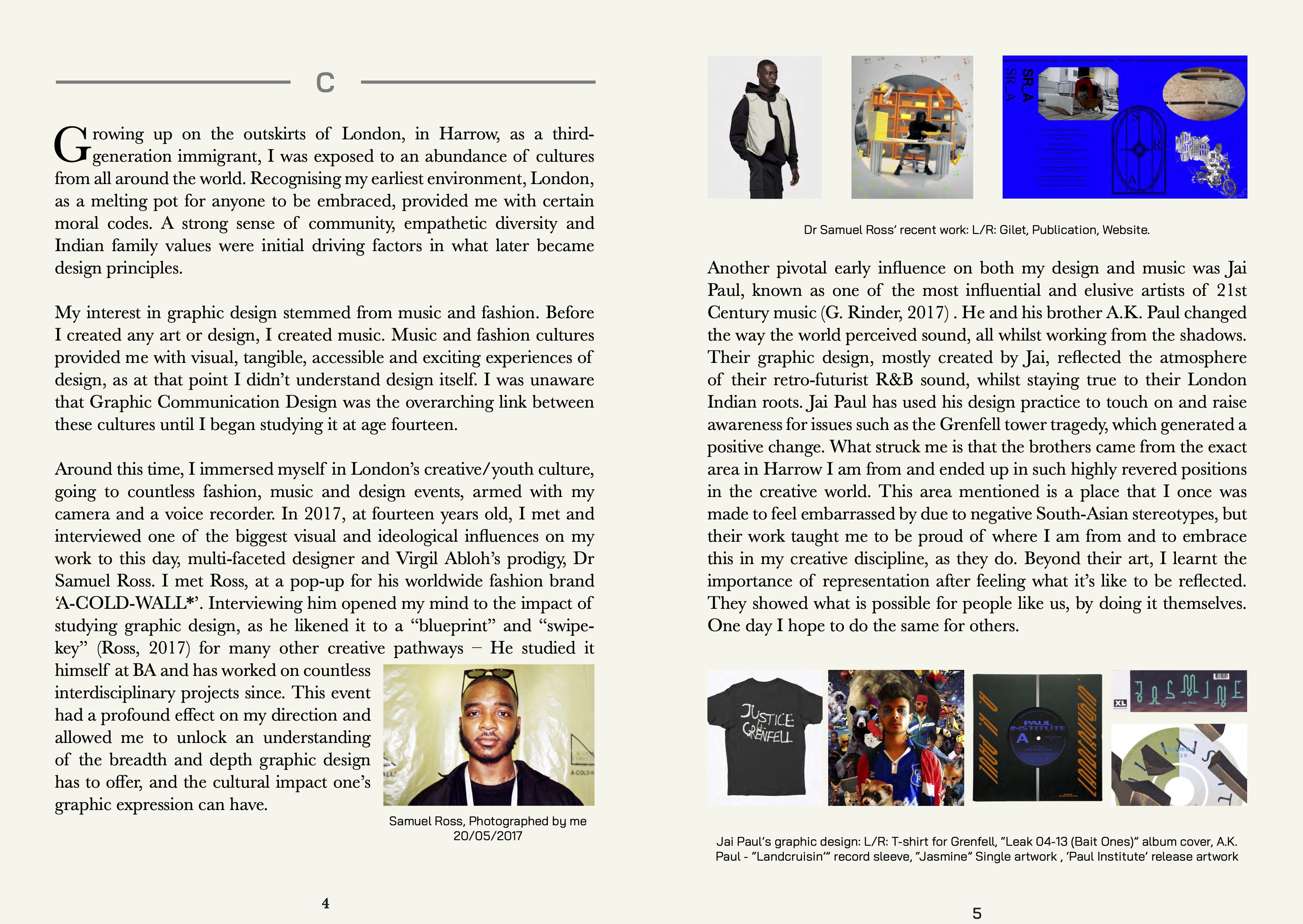
I came to this symbol in late 2018, after setting out to create a new form of branding as a part of my A-Level project.
Designed to be everchanging and encompassing of many things; things that all abridge my central worldview.
Should these change and morph in time, the symbol can acquire developed meanings as it has done, and I am open to it entirely dissolving one day.
At the moment, it also functions as an umbrella for certain, more focused, defined and named projects. For example “¬*¬ : Culture Magazine”, “¬*¬ : WorldView”, “¬*¬: Brown *n Blue”.
As per the original intent that was dreamt up years ago, I hope for this to become something wider than a representation of my own experience.

Brand Language
“¬*¬ to the world”
To project an idea : To broadcast : realisation through creation and publicising.
Allowing people to articulate the symbol, by means of its baseline intention : to give/serve.
Putting people and planet first, it all goes back ‘to the world’.
◊
Ethics
As a promise, at least 10% of all profits earned through a ¬*¬ project go to charity.
Each off-shoot project intends to hold a level of social value at whatever scale possible.
Nothing is created from a void : Understanding the contextual purpose of design to solve problems, where appropriate.
All are welcome to identify with the symbol.
An idea of conscious branding to contrast a consumerist age.
Creating for the passion of creativity itself, expression, for the joy/aid of others, to comment on realities, to facilitate new ways of cultural expression.
Attempting to create meaning, not creating hollow objects/visuals/sounds.
Hope for ¬*¬ to build bridges : eg. bridges between mind and world,
bridges between the established and the upcoming,
bridges between negative divides...
◊
Earth to _
//
_ to Earth
◊
¬*¬
To the World
“MY PRACTISE” ESSAY
(2023, Central Saint Martins)
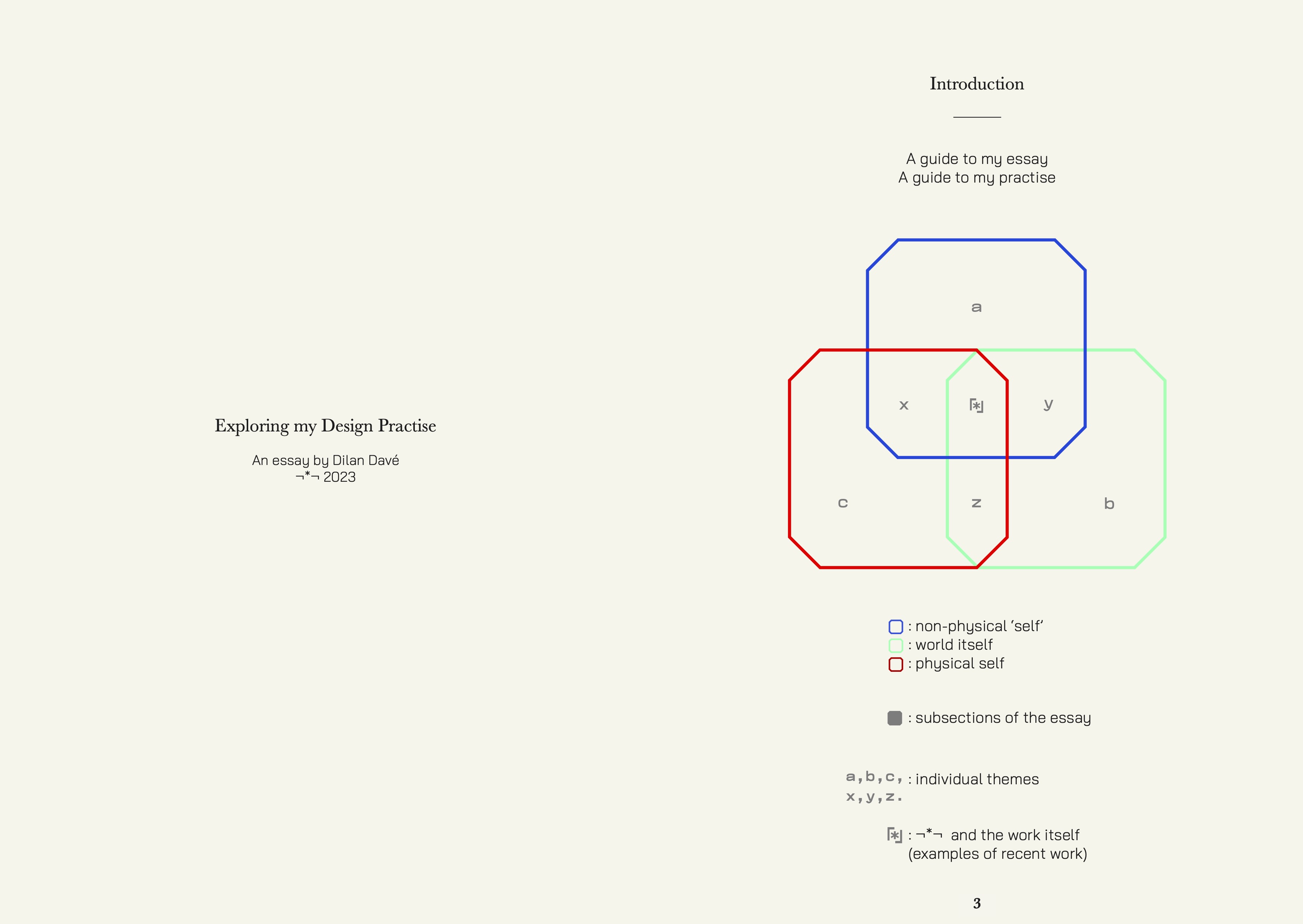
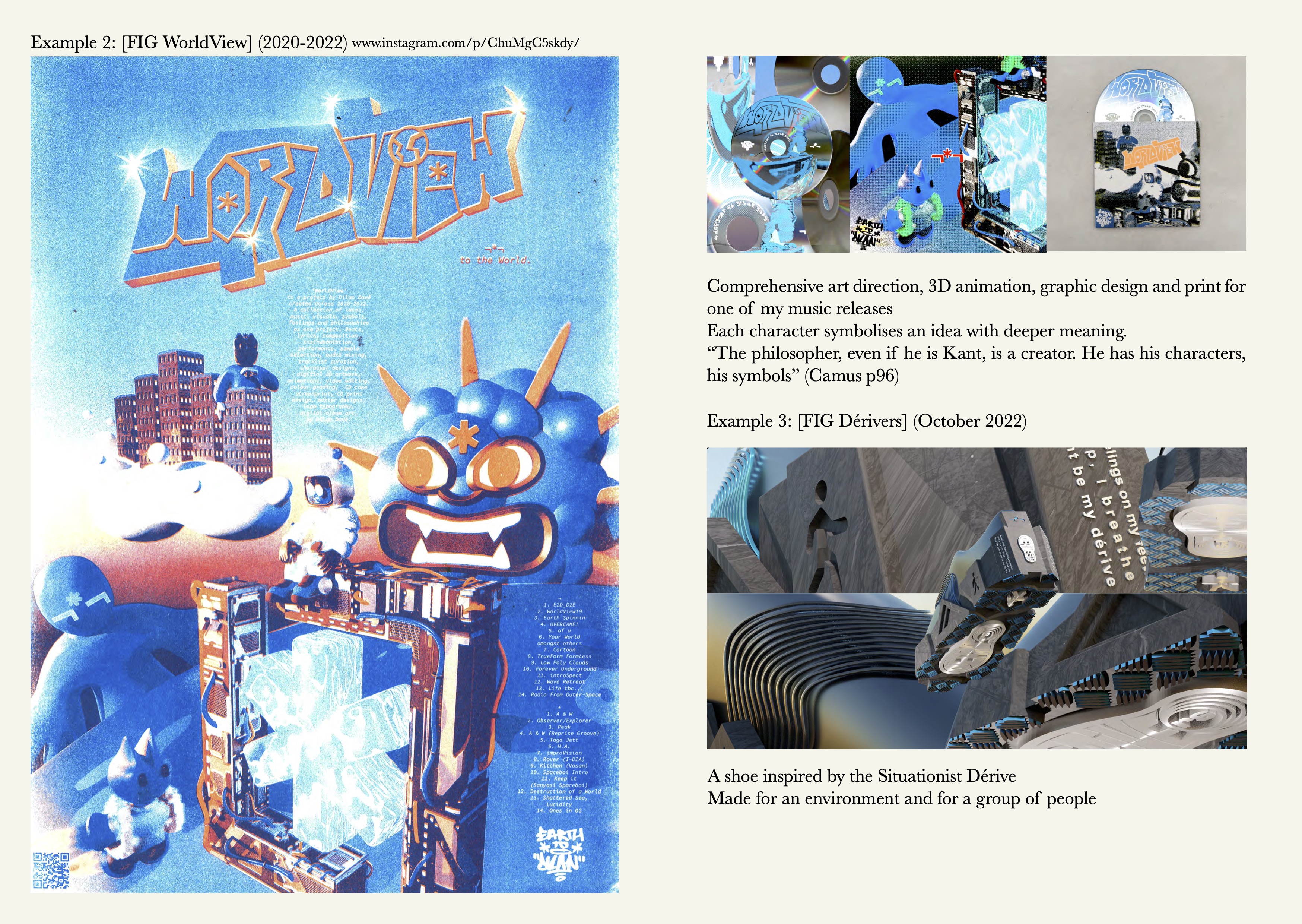

A NOTE ON WORLDS
The word “world” appears often in my work.
It’s a word that I believe sums up a lot about my creative approach.
The following short paragraphs are individual summaries on some different ideas about worlds, based on things I have learnt over Late 2022. These ideas are explored frequently and work as points of references for each project listed on the contents page to the right.
◊
A world distinguishes the aesthetic and feeling specific to an art-style/culture/typeface/brand/etc.
Things that designers have implicit responsibility for.
◊
To have, or be in, your own world is to be introspective and reflective, with the ability to dream things up.
Without this, creativity would struggle.
◊
We live in The World: A world that’s filled with “stuff”. To paraphrase a conversation I had with a Tutor, Paul Rennie, “it’s our job as designers to take interest in, and inspiration from ‘stuff’, so that we can learn from them and create more stuff to put back into the world.”
◊
What I’d call a ‘worldly’ designer is someone rooted in their surroundings and conscious of things outside of themselves (and their experiences). Someone actively using design as a service to help others, whilst working with others to design new worlds. Blazing trails with purpose; Opening doors and leaving the key in the keyhole.
I aspire to be a ‘worldly’ designer.
◊
8 billion people, 8 billion worlds. Bridging our internal and external worlds requires design as both a communicator and translator.
◊
“To the world” / “For the world”. For a piece of communication design to be most effective it must be released into the world, with intention.
◊
Worlds collide and worlds clash Not everyone has the same ideas, and that’s a beneficial thing. Through diversity (of thought, personality and worldviews), we can build on our individual worlds and collective World. Discourse and feedback are essential tools as a designer.
◊
The World itself is a collaborative effort that all beings (aware of it, or not) are designing.
◊